When designing a media wall, choosing the right colour is just as important as selecting the layout, shelves, or fireplace. The colour sets the tone of the entire room, influences how the TV blends into the design, and helps highlight any architectural features.
Whether you prefer bold drama or calm minimalism, this guide breaks down the best media wall colours for 2026, why they work, and how to choose the perfect shade for your home.
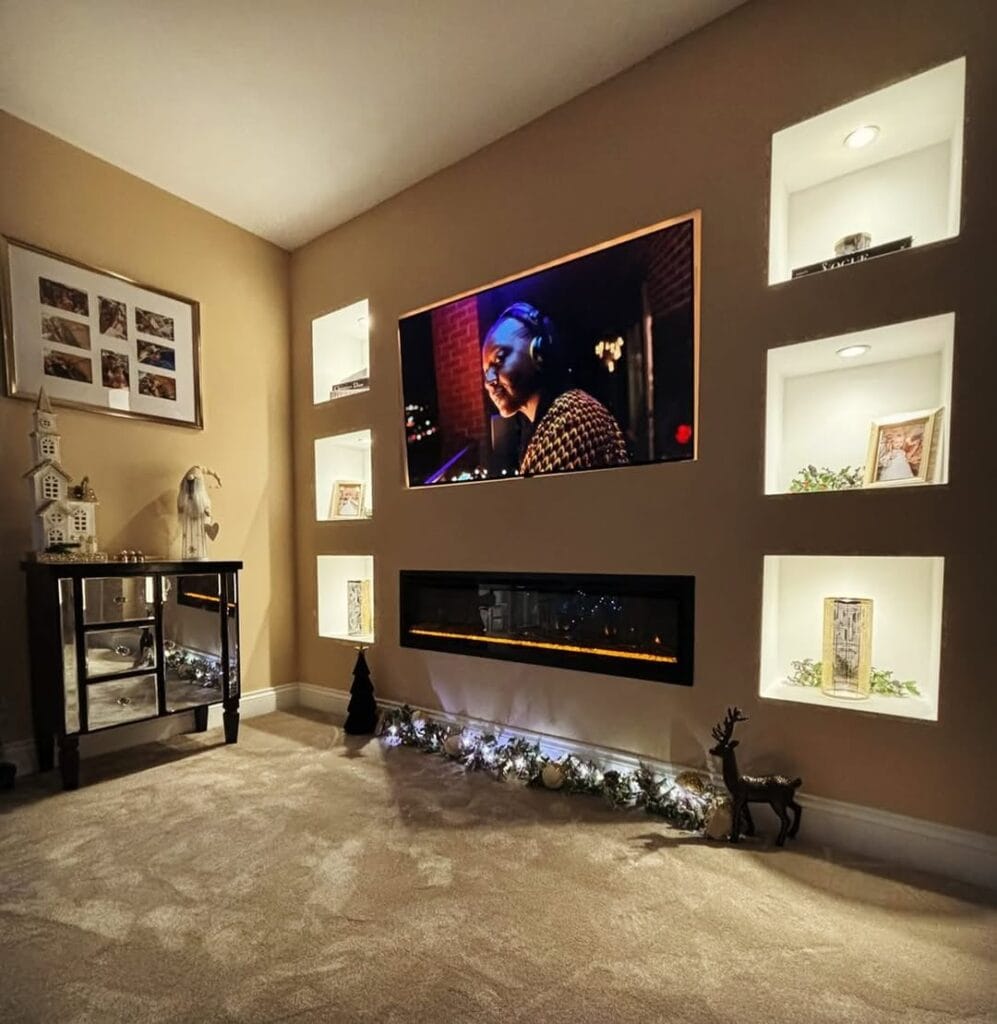
🎨 1. Charcoal & Graphite — The Ultimate TV-Friendly Colours
Dark charcoal and deep graphite are now the most popular colours for modern media walls.
Why? Because they visually “disappear,” the TV feels naturally integrated with the wall.
Benefits:
- Reduces the contrast between the TV and the wall
- Enhances a cinematic effect
- Works beautifully with LED mood lighting
- Looks premium in both small and large rooms
Best for: Contemporary homes, media wall + fireplace setups, and rooms with lighter surrounding décor.
🤍 2. Warm Neutrals — Greige, Taupe & Soft Sand
If you want something subtle and timeless, warm neutrals are perfect. These tones create a relaxed, elegant feel and pair effortlessly with natural materials like oak slats or stone-effect panels.
Popular 2026 shades:
- Soft greige
- Mushroom taupe
- Warm beige
- Clay neutrals
Why they work:
- Keep the room bright
- Add warmth without overwhelming
- Great for minimalist designs
Best for: Smaller living rooms, Scandinavian/Japandi-inspired homes, and those wanting a soft, inviting space.
🖤 3. Matte Black — Bold, Dramatic & Architectural
For homeowners looking to make a statement, matte black media walls are a top trend.
Matte finishes absorb light, giving the wall a sleek, high-end, architectural look.
Pair it with warm LEDs or walnut shelving for a stunning contrast.
Benefits:
- TV completely blends into the wall
- Perfect for ultra-modern spaces
- Works with both LED strips and recessed lighting
Best for: Open-plan homes, home cinemas, and designs with clean, sharp lines.
🌿 4. Natural Wood Tones — Oak, Walnut & Slat Panels
Wood tones are surging in popularity because they add warmth and texture that paint alone cannot achieve. Even if the main wall is painted, many homeowners combine it with wood-slat accents.
Why wood is trending:
- Brings warmth to tech-heavy designs
- Adds depth and natural texture
- Pairs well with both light and dark paint colours
Favourites for 2026:
- Light oak (Scandi feel)
- Rich walnut (luxury look)
- Black-stained timber (bold & modern)
Best for: Homes wanting a cosy, stylish, timeless feature.
🎨 5. Earthy Colour Accents — Terracotta, Olive & Deep Clay
Earthy tones help soften the modern feel of a media wall and connect the design to the room’s overall décor.
Trending accent colours include:
- Deep olive green
- Muted terracotta
- Warm burnt umber
- Soft clay pink
Use these sparingly — either on the whole media wall or on surrounding alcoves and cabinetry.
Why they’re trending:
- Bring warmth and personality
- Pair beautifully with natural woods
- Create a boutique, hotel-style look
Best for: Period homes, eclectic interiors, and anyone wanting something less conventional.
🌈 6. Two-Tone & Contrasting Designs
Two-tone media walls are one of the fastest-growing trends. Designers are combining:
- A dark central area for the TV
- A lighter perimeter or shelving section
- Wood + paint mixes
- Black detailing around fireplaces
Benefits:
- Adds depth and visual interest
- Helps zone areas of the media wall
- Works exceptionally well with LED lighting
Best for: Large walls that call for a layered, designer look.
⭐ How to Choose the Perfect Colour for YOUR Media Wall
Here’s a quick guide:
✔ Start with the TV
If you want the TV to blend in: Charcoal, Graphite, Matte Black
If you want it to stand out: Warm Neutrals or Light Colours
✔ Think about the room size
Small rooms: Warm neutrals, light greige, soft taupe
Large rooms: Dark colours, bold feature colours
✔ Consider the lighting
Bright rooms: Most colours work
Darker rooms: Avoid shades that feel too heavy unless using LED lighting
✔ Match your furniture & flooring
Oak floors → Greige or charcoal
Dark furniture → Soft neutrals or wood accents
🔥 Final Thoughts: A Media Wall Colour Should Complement the Design, Not Compete With It
The best colours for media walls in 2026 are those that strike the right balance between style and functionality. Whether you prefer the confident boldness of matte black or the calming warmth of greige, the key is choosing a shade that enhances your TV area and suits the overall feel of your home.
If you’re planning a media wall and want help choosing the perfect colour scheme, layout or installation method, our team is here to help.